What Do Colours Tell Us? What Do Colours Tell Us?
Experiences, Fiction

What Do Colours Tell Us?

A History of Colour in Art
Anna Arno
Reading
time 13 minutes

It seems that art can’t exist without them. They allow for the imitation of reality, draw the eyes, carry hidden meanings. The history of colour is a fascinating story of the changeability of human tastes and the power of our convictions, associations and… stereotypes.  

“When we are asked ‘What do the words “red”, “blue”, “black”, “white” mean? We can, of course, immediately point to things which have these colours, but our ability to explain the meanings of these words goes no further!” 
Ludwig Wittgenstein
 
Stendhal’s most famous novel was supposed to be entitled “Julien”, after the main protagonist. Later on the writer decided to go with The Red and the Black. “It’s a uniform and a cassock,” Tadeusz Boy-Żeleński explained. “It’s the two Frances: Napoleon’s France and the Bourbons’ France.” Such is the most common interpretation of this enigmatic title. However, the red’s link to the army is not clear-cut, as Napoleonic uniforms were blue. That aside, red and black evoke numerous other associations. Love and death. The colours betted on in roulette. Julien Sorel also speaks of “black ambition”, which could be counterbalanced by passionate red… Stendhal surely liked the ambivalence of his colouristic title – right after The Red and the Black, he started working on a book called The Pink and the Green.
 
A man turns purple with fury, goes white with fear, or falls into black despair. But there are also days when he is feeling blue or looks at the world through rose-coloured spectacles. Colours rouse strong emotional associations and carry symbolic meanings. However these – depending on the historical time and place – can differ, and even be contradictory. Colours, which in some periods were associated with savagery, the Devil or crime, in other periods won back their prestige as royal or even divine.
 

The Greek tetrad of colours

 
Up until the 19th century, it was thought that the ancient Greeks didn’t hold colours in high esteem. “There are four colours, in accordance with the number of the elements: white, black, red and yellow,” wrote Empedocles, followed by Plato in Timaeus. But what about the blue of the sky and the green plants of spring? Homer compared the colour of the sky to copper and iron, and that of the sea to wine. For us these are strange associations, but the poet was supposedly blind. Some even speculated that the eye structure developed after the ancient times, and that the Greeks couldn’t distinguish all shades. The Roman architect Vitruvius praised the ascetic approach of Greek painters: “The fact is that the artistic excellence which the ancients endeavoured to attain by working hard and taking pains, is now attempted by the use of colours and the brave show which they make, and expenditure by the employer prevents people from missing the artistic refinements that once lent authority to works.” But it is not true that the Greeks couldn’t tell colours apart or kept them in disdain. First, they preferred the colours of civilization over the colours of nature. Second, they distinguished between ‘painting proper’ and architectural decoration. And, at least since the end of the 18th century, we have known that Greek statues were not snow white. They were indeed painted, quite vividly too, and what’s more – not at all realistically (for example, hair was ‘dyed’ blue).

Nonetheless, the false image of naked marble has proven particularly lasting. The entirety of neoclassical aesthetics was based on it – from Canova’s Amor and Psyche, to the White House. According to these criteria, whiteness was a synonym of beauty and good taste, while colour was barbarity, debauchery and vulgarity. There is even an erotic subtext: male, distinct whiteness was juxtaposed with sensual, blurry colours. Johann Winckelmann, known as the father of German art history, declared that the whiter the body, the more beautiful it was. While examining works of art excavated in Pompeii and Herculaneum, he noticed the remnants of pigments. He could not come to terms with this; he came to the conclusion that the ginger-haired Artemis in red sandals must have been created by the Etruscans. Even Goethe insisted that only barbarians, simpletons and children had a weakness for colour. Sophisticated people avoided garish-coloured clothes and on an everyday basis surrounded themselves with toned-down shades.

To make us realize that white Aphrodite and Apollo have nothing to do with ancient Greece, scholars have reconstructed original polychromes. But it is difficult to get rid of the preconceptions nurtured for such a long time. Rodin came clean – his heart told him that sculptures could never have been colourful… There were even cases when art dealers and restorers aided the predilections of their contemporaries by cleaning ancient works of art of the remnants of pigments. In the 1930s, the British Museum polished the famous Elgin Marbles into a pearly white.

Parthenon frieze, Phidias, c. 447–438 BCE. Fragment of Parthenon marble taken from Athens to London by Lord Elgin, British Museum
Marble bust of the Roman Emperor Caligula, Carlsberg Glyptotek Museum, Copenhagen, Denmark
A coloured cast of Caligula’s head, on display at the “Gods in Colour” exhibition, Ashmolean Museum in Oxford, 2015
A coloured cast of Caligula’s head, on display at the “Gods in Colour” exhibition, Ashmolean Museum in Oxford, 2015
“Phidias Showing the Frieze of the Parthenon to his Friends”, Lawrence Alma-Tadema, 1868, Birmingham Museum and Art Gallery

Blue

The volatile fate of colours can be examined using blue as an example. Since World War II, it has won multiple surveys in Western countries for people’s most favourite colour. But the popularity of blue came late. Several ancient languages don’t even have a term for it. Poets described sky or sea waves, but they didn’t see ‘blue’ at all in them. For Romans, it was an outright barbaric colour. Tacitus and Caesar said that Celts and Germanic peoples painted themselves blue to scare off their attackers. Blue eyes were practically perceived as a physical defect – they meant a savage or a woman of easy virtue. Only Egyptians liked blue, because they believed it brought good luck in the nether world. Supposedly they produced this pigment, like glass, from a mixture of limestone, sand and minerals containing copper. The resulting glaze, ground and mixed with egg white or glue, produced a pale blue shade and was the first synthetic pigment in history.

Information

Breaking news! This is the first of your five free articles this month. You can get unlimited access to all our articles and audio content with our digital subscription.

Subscribe

Blue only got some appreciation in the Middle Ages. God was associated with light, and light was blue. Pale shades started appearing in the backgrounds of illuminations, and blue glass – next to the ruby-coloured one – started getting inset into Gothic windows. At dusk, reds seem almost black, while blues and purples stay visible for longer. The importance of blue in the art of Gothic stained-glass windows can be attested at the very least by its number of shades: from pearl-blue through to turquoise, to saturated sapphire blue. Blue became the colour of firmament. Haloes were also often blue, especially the square nimbuses used to distinguish the ‘living saints’. Cherubs, the angels of Divine Wisdom, were equipped with blue wings. But what made blue truly fashionable was the Virgin Mary’s cloak. In the 12th century, the Capetian dynasty adopted golden lilies on a blue background as their crest. And as such, blue – once ‘barbarian’ – reached the status of a royal colour and triumphantly joined black, red and white in heraldry. In a natural way, it started to complement, but also rival red.

In the 15th century, the Renaissance takeover contributed to the career of blue. Instead of a gold background in frescoes and panel paintings, a bright sky appeared. Shades of blue were also served by the Reformation. Its followers advocated sternness, so the painterly palette and clothing were dominated by grey, discreetly joined by blue. It wasn’t just its shades that were changing, but also how they were interpreted. A blue tailcoat was worn by Werther when he had his first dance with Charlotte. Crowds of exalted young men started wearing the same. Towards the end of the 18th century, blue became a romantic and melancholic colour for good. It was also linked to alcohol – already in the Middle Ages, dyers were advised to use a drunkard’s urine as a colour fixer. In English, the ‘blue hour’ means the end of the working day, when workers, instead of going straight home, stop for a drink.

In the 20th century, blue, next to black and grey, has dominated clothing. It is the colour of the uniforms of policemen, sailors, firemen, customs officers and postmen. And, in fact, all others, young and old, who wear jeans. Invented in the 19th century as trousers for Californian workers, 100 years later jeans became a student staple. In the 1980s, they started to lose popularity in the West, but in Eastern Europe became a symbol of anti-communist revolt. Yet, as noted by Michel Pastoureau, a scholar researching the history of colour, jeans could not play such a role for long, because… they are blue. It is not a colour of dissent, but rather of consensus and peace. No wonder it can be found on the flags of the European Union, NATO and the United Nations.

“Kiss of Judas”, Giotto di Bondone, 1303–1305, Scrovegni Chapel

Red

Not all languages of the world have the same amount of names for colours. The most simple cultures only distinguish between white and black – light and darkness. The next colour to appear is red. It is also the first colour registered by newborns. Red is the eternal enemy of blue. This antagonism even transferred to dyers producing the two pigments. In Thuringia, the ‘red’ merchants attempted to convince stained-glass painters to paint devils in blue, to put people off the rival colour. In the Middle Ages, red was associated with war and was the colour dedicated to men. Women most often wore humble blue. Today everything is reversed: toned-down blue works better in men’s suits, while red dresses are a symbol of women’s audacity and fiery temper.

Red is the colour above all colours. It is tempting and forbidden; it signals danger, it is a sign of passion and compassion, martyrdom and revolution. In the 19th century, brides in Europe wore red (Indian women still get married in red dresses). But red dresses were also worn by prostitutes; the colour branded them, distinguished them from ‘decent’ women. Red is caritas, but also eros – carnal love, sinful and lustful. In mediaeval symbolism, red was the only colour whose shade mattered. When dark and saturated, it was the colour of power. “The purple of martyr Saint Agnes in Rome, Justinian and Theodora in Ravenna, Pantocrator in Sicilian mosaics – it is a very special colour, a dark violet with a brown hue, in which the red is deeply suppressed,” wrote Maria Rzepińska, an expert on the matter. On the other hand, Mary Magdalene wears a red cloak and “it is always the ‘plain’ red, cinnabar red, and not the mysterious purple, the imperial colour.” The colour of the cloak distinguished the controversial saint, the fallen woman who found Jesus.

In Christianity, red symbolizes the sacrifice of Christ, passion and the Divine Mercy. And blood also means crimes, carnal sins and Biblical prohibitions. Starting from the mid-13th century, Cardinals have worn purple robes – they adapted the colour of the belt worn by Roman senators. In the late Middle Ages, popes wore red robes. Only in the 16th century did Pope Pius V change the colour to white – the colour of a Dominican habit.

Illustration from “Little Red Riding Hood” in “The Fairy Tales of the Brothers Grimm”, Arthur Rackham, 1909

Green

The colour of life, youth and hope. The colour of lizards and emerald, but also of dragons, absinthe and poison. You can go green with envy or be a greenhorn and know nothing about grown-up things. Across the centuries, green was at times the colour of anathema; at other times the colour of safety, serenity, the politically engaged or neutral. The Greeks didn’t have a precise term for green – the word glaukos refers to greenish things, but also means a shade of blue, closer to grey, livid, or even a bit yellow or brown. Homer used this term to describe sea water, as well as the colour of eyes, leaves and honey. Latin developed more precise terms for green – perhaps because of the higher sensitivity to nature in Roman culture, with its predominantly rural character. Viridis, from which terms for green in Romance languages are derived, is related to words meaning life, growth, masculinity and strength. The Romans adopted recipes for green pigments from the Celts and Germanic people. However, this colour did not play an important role in their everyday life – exactly because it was associated with the tastes of the ‘barbarians’. On the other hand, lasting and luminous shades of green were difficult to achieve, which is why green started being perceived as a capricious colour – it got linked to everything that was fleeting, uncertain and changing. It was the colour of chance, of fate; couples in love wore it, but it also dominated the attire of jesters and hunters. A long time before the introduction of the dollar, gaming tables were painted green. Even today, this is the colour of the main wedding tables, sports fields and courts.

But green can also be cursed. Supposedly emeralds, considered ‘unlucky’, don’t sell as well as other precious stones. Stage actors refuse to act in green costumes, because Molière was wearing one when he collapsed on stage and died soon after. There is a pinch of wisdom behind these superstitions, though. Green paints derived from copper compounds were highly toxic. According to one hypothesis, Napoleon’s death was caused by wallpaper in Scheele’s Green, which was an arsenic compound. Queen Victoria had an obsessive fear of green and Franz Schubert was ready to run to the other side of the world to avoid this ‘accursed colour’ (in Schubert’s Die schöne Müllerin, green is the colour of jealousy – the main protagonist falls in love with the maid of the mill and gives her a green ribbon, but the girl chooses a hunter, also dressed in green). In the moral hierarchy of colours, green was usually perceived as the colour of deceit, unworthy of a rightful citizen or a pious Christian. No wonder it was so loved by that madman, Nero: during horse races, he always placed his bets on the stable that was green, he dressed in green and gorged on leeks. During breaks between gladiator fights, he used to bring a huge green emerald to his eye.

The Middle Ages also cultivated positive associations with green: tables in scriptoria were painted in this ‘toned-down’ colour and a powder made of green stones was used to produce eye ointment. Bartholomaeus Anglicus, a 13th-century Franciscan monk and professor at a university in Paris, ascribed its amazing properties to the fact that green is located between the elements: “Gréene colour is most liking to ye sight, for comming togethers of firy parts & of earth. For brightnes of fire yt is in gréene is temperate, & pleaseth ye sight.” Green was often considered a transitional colour, good as a background. The 15th-century theorist of art Cennino Cennini provided a recipe for green paper and stressed that this was best for “drawing on with shade-colours, and with white.” Goethe, who was an advocate of blue, in The Theory of Colours recommended using green for wallpaper, especially in the bedroom. Theologians, who set up liturgical colours, clearly also thought green to be a humble colour, since they assigned it to Sundays in Ordinary Time.

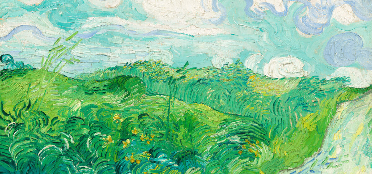
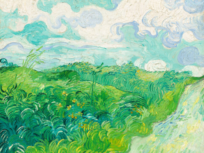
“Green Wheat Fields, Auvers”, Vincent van Gogh, 1890, National Gallery of Art, Washington

In the second half of the 19th century, following the theory of colour, green was perceived automatically as the opposite of red. Vincent van Gogh, telling his brother about his freshly finished The Night Café, highlighted the contrasts: “I have tried to express the terrible passions of humanity by means of red and green. […] So I have tried to express, as it were, the powers of darkness in a low public house, by soft Louis V green and malachite, contrasting with yellow-green and harsh blue-greens, and all this in an atmosphere like a devil’s furnace, of pale sulphur.”

As a mixed, gentle colour opposed to red, green found its way into pedestrian crossings and traffic lights. But the contrast is also a cultural phenomenon – the juxtapositions of green and red or red and yellow are particularly sharp to our eyes. However, in the Middle Ages the combination of green and carmine seemed gentle, while yellow next to green produced a clash.

Some are surprised that the association of green with nature was in fact an invention of Romanticism. Before then, nature was described by four elements: fire, air, earth and water. In contemporary times, green has been particularly appreciated – linked to the protection of the environment and everything that is clean and healthy. It is no more a cursed, devilish colour; it is associated with a liberal lifestyle in accordance with nature. When the spring comes, it’s good to exercise one’s green fingers or lay on green grass.

Yellow

Yellow is as lucky and at the same time as accursed as green – similar to gold, it often imitated it. The Romans valued yellow; robes in this colour were worn on festive occasions, for example at weddings. In the Middle Ages, painters used yellow instead of gold out of thriftiness. Associated with light and warmth, it could be a divine colour. But the positive connotations were snatched by gold. By comparison, yellow is a liar. It smells of sulphur, it is unhealthy and as bitter as bile. Courtesans were forced to wear yellow symbols in the Renaissance period. Vermeer’s Procuress wears a canary yellow jacket. More or less from the mid-12th century onwards, yellow was the colour of sin, falsehood and betrayal. Let’s just recall Giotto’s saffron-coloured cloak of Judas in the Capella Dell’Arena in Padua. The ginger-haired 12th apostle wearing yellow is a Jew from an antisemite’s dream. Yellow excludes and stigmatizes. The Nazis who forced Jews leaving ghettos to wear yellow bands and stars were following a dishonourable tradition. From the Middle Ages, yellow was also the colour of madness. The complex symbolism of yellow was used by Ewa Kuryluk in her ‘yellow installations’, conceived over the span of two decades. She paid homage to her dearest ones, branded with mental illness and the history of the Holocaust. “Mum used to have yellow hallucinations: a swarm of yellow birds, yellow snow, yellow smoke from the chimney,” the artist recalled.

We rarely choose it in everyday life. It’s too harsh, daring, urgent. A yellow car is probably a millionaire’s whim or some weirdo’s four wheels. In polls on favourite colours, yellow is at the tail end. It only precedes wishy-washy browns. But possibly it is culture that spoils our tastes. Because children like yellow – they love drawing yellow suns and warm yellow light in the windows of houses.


Also read:

Building with Colour Building with Colour
i
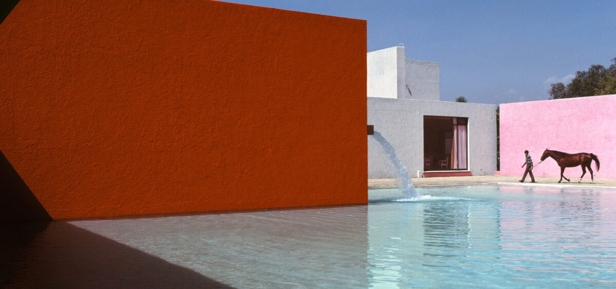
René Burri, San Cristobal – stable, horse pool and the Egerstrom house (1966–1968), designed by Luis Barragán and Andrés Casillas, 1976. Photo by René Burri / Magnum Photos / FORUM
Art, Experiences

Building with Colour

The Work of Luis Barragán
Zygmunt Borawski

He was able to capture the colour of a flower and then use it for walls and stairs. Meet Luis Barragán, an enthusiast and visionary who added missing colours into the panorama of a city.

Colour in architecture is a tricky subject. Choosing the right colours and shades requires sensitivity, talent and knowledge. In the space of the last two decades, Poles have learned that it is not an easy or intuitive art. A festival of thermomodernization has been going on in our country. Most housing associations and boards of homeowner associations try to outdo one another in painting the façades of their blocks of flats and tenements with increasingly gaudy colours, not uncommonly without prior consultation with an architect or an artist. You don’t need to be an art graduate to realize that this is not always for the best.

Continue reading