Staying in the Black
i
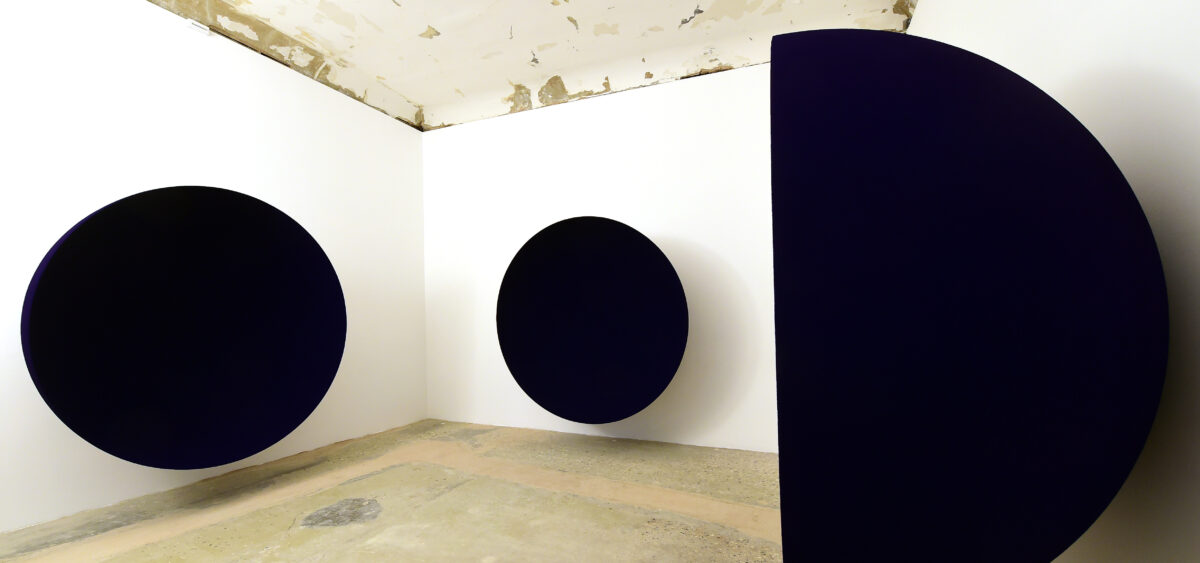
VENICE, ITALY - APRIL 19: General view of the english-indian artist Anish Kapoor retrospective anthologial exhibition "Anish Kapoor" at the Palazzo Manfrin on April 19, 2022 in Venice, Italy. (Photo by Roberto Serra - Iguana Press/Getty Images)
Art

Staying in the Black

Karol Sienkiewicz
Reading
time 10 minutes

To the impressionists, the color black was a black sheep, but, looking at the entire history of painting, it should be considered more of a dark horse. Even if it’s not really a color but a lack thereof. 

The fact that the art world dresses in black has long been joked about. Show openings, especially the fancier ones, are dominated by black. Apart from sadness or grief, this color may mean strength, power, elegance, sophistication. It’s always trendy. But some see it as a kind of fashion laziness: how can someone working with art not appreciate other colors? The business of black is not as simple as it seems. 

There’s not even a consensus about whether black is a color at all. The discussion has been going on for centuries. Black is defined as a lack of hue, so, according to some, it has no shades. Currently, scientists lean towards the opposite position. After all, black features on the color spectrum. Here we come across the issue of the physical nature of light, or, more precisely, how it can be absorbed by various materials. The more a material absorbs the separate light frequencies, the darker it is. Irrespective of the debate about the status of black, it’s impossible to deny that black is deeply rooted in culture. 

Goya’s Secrets 

Black brings to mind death, grief, depression, and the fear of darkness and of confinement. Painters of the Middle Ages used it to depict the devil. But it is also the color of the night sky—the dark background where stars appear. Black stands for dominance, too: judges wear black robes, and the black belt is the highest distinction in martial arts. It’s also related to things that are illegal or dangerous—we have the black market and the Black Death, otherwise known as the Black Plague.  

Information

Breaking news! This is the forth of your five free articles this month. You can get unlimited access to all our articles and audio content with our digital subscription.

Subscribe

Francisco Goya’s tenebrous paintings initially decorated the walls of Quinta del Sordo (Deaf Man’s Villa), which the painter purchased at the start of 1819. He created these works between 1821 and 1833, using only shades of ochre, brown, grey, and (of course) black. Their collective name comes from not only the dark palette but also their gloomy mood. Goya, in his seventies at the time, was lonely and mentally broken. He never thought of showing these paintings, never mentioned them. They were moved to canvas fifty years after his death and ultimately found their way into the Prado Museum collection. All fourteen works depict visions straight from a horror movie: Saturn devouring his own son or a humanoid goat in a monk’s habit giving a sermon to a congregation of witches. The meaning of this series is still being disputed; throughout the years it has been variously interpreted via the lens of psychiatry, psychopathology, and politics. 

Francisco Goya, “Two Old Women Eating Soup”, 1819–1823, Prado museum; public domain photo

The color black emphasizes contrasts, accentuates, and hides secrets. In the Middle Ages, evil black started to be juxtaposed with good white. While the Benedictines wore black robes as a symbol of humility, those of the Cistercians were white to signal purity and innocence. The Benedictines accused the Cistercians of hubris, and the Cistercians’ opinion was that the robes of the other order were in the hue of sin, death, and the devil. 

Black was also the first color used in art. Paleolithic artists—cave painters—used charcoal to draw on the walls of caves (among others, in the most famous ones in Lascaux). Some of them are no less than forty thousand years old. Ancient Egyptians considered black a positive color, associating it with the fertile soil created by the flooding of the Nile, so it symbolized fecundity. Black figures also featured on Greek vases. Ancient Romans, in turn, started using this color as a shorthand for grief. The first ink used by printers was black. 

Panathenaic terracotta amphora from around 530 BC, Metropolitan Museum of Art; photo: public domain
World-renowned archaeologist Henri Breuil examines carvings in the perhaps even more famous Lascaux Cave; photo: Wellcome Collection, CC BY 4.0

However, some artists (for example, impressionists) completely rejected the color. Claude Monet never used it. An anecdote told by Renoir entered the annals of history: one day a painter ran out of black paint, and that was the beginning of impressionism, a movement in painting that uses the interplay of colors to introduce dynamism to images. 

Kapoor’s Records 

Meanwhile, today, the race is on to see who will produce the most light-absorbent material. Currently, Vantablack is considered to be the winner. The substance, made of carbon nanotubes, absorbs over 99.97% of the visible light spectrum. It became infamous when, in 2016, Surrey NanoSystems—the UK company that produces Vantablack for the defense industry—granted the British artist Anish Kapoor exclusive rights for its usage in art. When the news spread around the world, other creators protested against one artist having a monopoly on this material. 

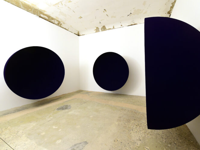
Kapoor first exhibited sculptures coated in Vantablack during the Venice Biennale in 2022. At the time, he explained that this is not a black that one squeezes out of a tube, and that he had spent eight years working on roughly a dozen pieces. He claimed to have exclusive rights not to the color but to access to the technology. Still, people started speaking of “Kapoor Black,” similar to International Klein Blue—a deep shade of blue patented by Yves Klein in 1960. But the French artist created the shade himself, in collaboration with paint manufacturer Édouard Adam, while the Brit makes use of someone else’s invention. 

In the Baroque interiors of the Venetian Gallerie dell’Accademia, Kapoor placed sculptures that the viewer perceives as black voids. They are so dark and absorb so much light that we no longer see them as three-dimensional. Like black holes, they seem to suck up the space around them. The sculptor used this color because of his interest in the concepts of existence and non-existence. Vantablack creates a new kind of illusion, an impression of a world with no depth—this hue seems to undo the Renaissance’s discovery of perspective. 

Bałka’s Emptiness 

Artist Mirosław Bałka—who created a huge installation entitled How It Is in 2009 at The Turbine Hall at London’s Tate Modern—might have loved to use Vantablack, had the technology been available at the time. This monumental hall is one of the world’s largest exhibition spaces, presenting artists with considerable opportunities, but it is also a challenge. Bałka built an enormous structure that looked like a container, thirteen meters tall and thirty meters long. Once the viewers entered it via a ramp, they encountered black. The interior was coated with a special light-absorbent material; hence, the impression of complete darkness swallowed up the audience like a black hole. Spectators felt their way into the emptiness as if they were blind, worried that they’d bump into others or walk into the back wall. Once they reached it, they could turn around and see the shadows of others as they touched the void. 

Mirosław Bałka’s monumental installation “How It Is”, 2009, Tate Modern, London; photo: Peter Macdiarmid/Getty Images

Bałka’s installation prompted many interpretations, and, while working on it, the artist wrote down all the various associations. The piece of paper with his notes was reproduced in the exhibition catalog. Apart from the title (taken from Samuel Beckett’s novel), the work’s dimensions (3900 m3), and the initials of the authors of texts, Bałka included a list of possible connotations that occurred to him—some he crossed out, others he emphasized. Some of the keywords were: Malevich, huge black vibrator, Mecca, Kaaba, Jonah, Hades, black holes, visions of hell, Babi Yar, holes, caves, Plato’s cave, “going to my basement,” Noah’s Ark, open graves, or Courbet’s The Origin of the World. 

The viewers had the impression that their senses were curtailed and that they were deprived of visual perception, which made them focus on sound or touch. Here, black was, most of all, darkness, lack, and emptiness. It’s worth mentioning that at the start of the twentieth century, Wassily Kandinsky, who experienced synesthesia, interpreted black as dead silence. 

Malevich’s New Era 

An obvious point of reference for Bałka was Malevich’s Black Square. In 1915, the Russian painter used geometry and black to return to the sources of painting, to art’s point of origin. His painting was paradoxical and radical. It suggested a complete lack of interest in anything apart from the work—an indifference to the real world, a rejection of the figurative. Black Square is a clear declaration about abandoning the thought of reproducing reality and an urge to create a completely new world of shapes and forms. Malevich called his approach to painting suprematism. Black Square was to be the first work of this movement, an object different from everything that had hitherto been featured in art. It represented nothing; it was a symbol of a new era. 

When, in 1915, Malevich first exhibited Black Square, he hung it in the corner of the space, at an angle—precisely how Orthodox icons were hung in Russian homes. That way, he wanted to mark the painting’s role within the whole exhibition and emphasize its spiritual weight. While the color itself no longer carried meaning, it accentuated the significance of the surface, where the visible encountered the invisible, the spiritual. The work became the artist’s trademark. He would sign later paintings, in which he returned to figurative art, with a small black square. During his funeral, the automobile carrying his casket (which he had designed himself in the suprematist style) had a black square on its hood; the shape also featured on flags carried by the mourners. 

Bujnowski’s Dusk 

Even if black isn’t really a color, and if not all artists use advanced technologies like Anish Kapoor, black is still frequently used to direct our attention precisely to the materiality of a painting. Many contemporary painters play with Malevich’s iconic work, for example by returning to the question of whether it’s possible to create a perfectly black painting and what, fundamentally, makes a painting—is it ground covered with paint? A painting is layers of paint on canvas. Artists don’t reach for Vantablack; they use black paint from a tube. 

There is no illusion in Malevich’s work, but even in Black Square, black and white are not neutral or pure. An X-ray examination of a version of the work revealed that underneath it there’s another composition that Malevich painted over. The square itself shows brushstrokes and cracks in the paint. The American painter Ad Reinhardt also played with black. In 1963, he exhibited Abstract Painting, which at first glance seemed like just a black canvas, but up close revealed various tones and a geometric three-by-three grid. Each of the nine smaller squares was covered with a different shade of black. The French painter Pierre Soulages, in turn, started to cover whole canvases with thick layers of black paint in 1979. The light plays on the black surface, determining how the work is received. The light reflected from the surface reveals the work’s texture, all its grooved and smooth parts. This is why it’s so difficult to capture these paintings in photographs. For Soulages, black meant light. 

The Polish painter Rafał Bujnowski treats this color similarly. His paintings, done in black on black, reveal their composition through the structure of paint itself. They change depending on the angle of the viewer and the light. They are often nocturnes, night landscapes, often lit only by the moon. In a cycle of videos from 2004 entitled Dusk, the artist documented himself gradually covering black-and-white landscapes with black paint, and the painting slowly becoming a black monochrome. The titular dusk fell over it. Black almost became Bujnowski’s identifying mark. By using this color, he rendered the division between figurative and abstract art somewhat invalid. His paintings are monochromatic and abstract, but at the same time—if one looks at them the right way—they reveal a more complex, frequently figurative composition. 

Kumagai’s Darkness 

Finally—paintings darken with time. They turn black as a layer of grime covers them, especially if they have been hanging in rooms where candles burned, such as chapels or churches. At the end of the twentieth century, the restoration of the Sistine Chapel became a sensation; the conservators returned bright colors to the interior, and tourists couldn’t get used to this novel sight. Rembrandt’s famous Night Watch was originally not nocturnal at all—it very much showed the daytime. 

Sometimes the darkening is also the result of inexpert mixing of paints. In 1908, the Japanese artist Morikazu Kumagai painted the body of a woman who died by suicide under the wheels of a train, lit by the torches of the people present at the site of the tragedy. This was how he remembered an event he had witnessed five years earlier. The image was considered drastic, and the artist couldn’t show it to an audience for a long time, but today, when one sees it at a museum, it’s difficult to discern anything. It looks like a black monochrome. 

In the early years of his career, Kumagai confronted the challenge of depicting objects plucked from the darkness by a specific light source. It is said that, while working on the above-mentioned image, he would lower the blinds in his studio and work in the dark. But the effect we see today was not his intention. Currently the consensus is that the painting turned black due to chemical reactions between incorrectly selected pigments. In the case of the Japanese artist, the black on the painting not only creates a nocturne but is also the result of a mistake or of the flow of time, even if such a result wasn’t planned. The blackness deepens. 

Also read:

Maria Prymachenko: An Artist for Our Times
i
Maria Prymaczenko, Our penguin friends wanted to look at Polesie: How they plow here and how beautifully young people dance, 1989
Art

Maria Prymachenko: An Artist for Our Times

Kacha Szaniawska

She is Ukraine’s most famous artist. She painted, drew, decorated ceramics, and embroidered. Her designs have graced postage stamps and coins, and she remains an inspiration to artists and textile designers today. 

The world rediscovered Maria Prymachenko on February 27, 2022, when the Ukrainian Ministry of Foreign Affairs reported that Ivankiv Historical and Local History Museum (in Kyiv Oblast) had burned down following a Russian bombardment. Twenty-five of the artist’s works were inside, and local residents managed to rescue some of them. 

Continue reading